N26 - CARD & PACKAGING
Payment cards for every personality
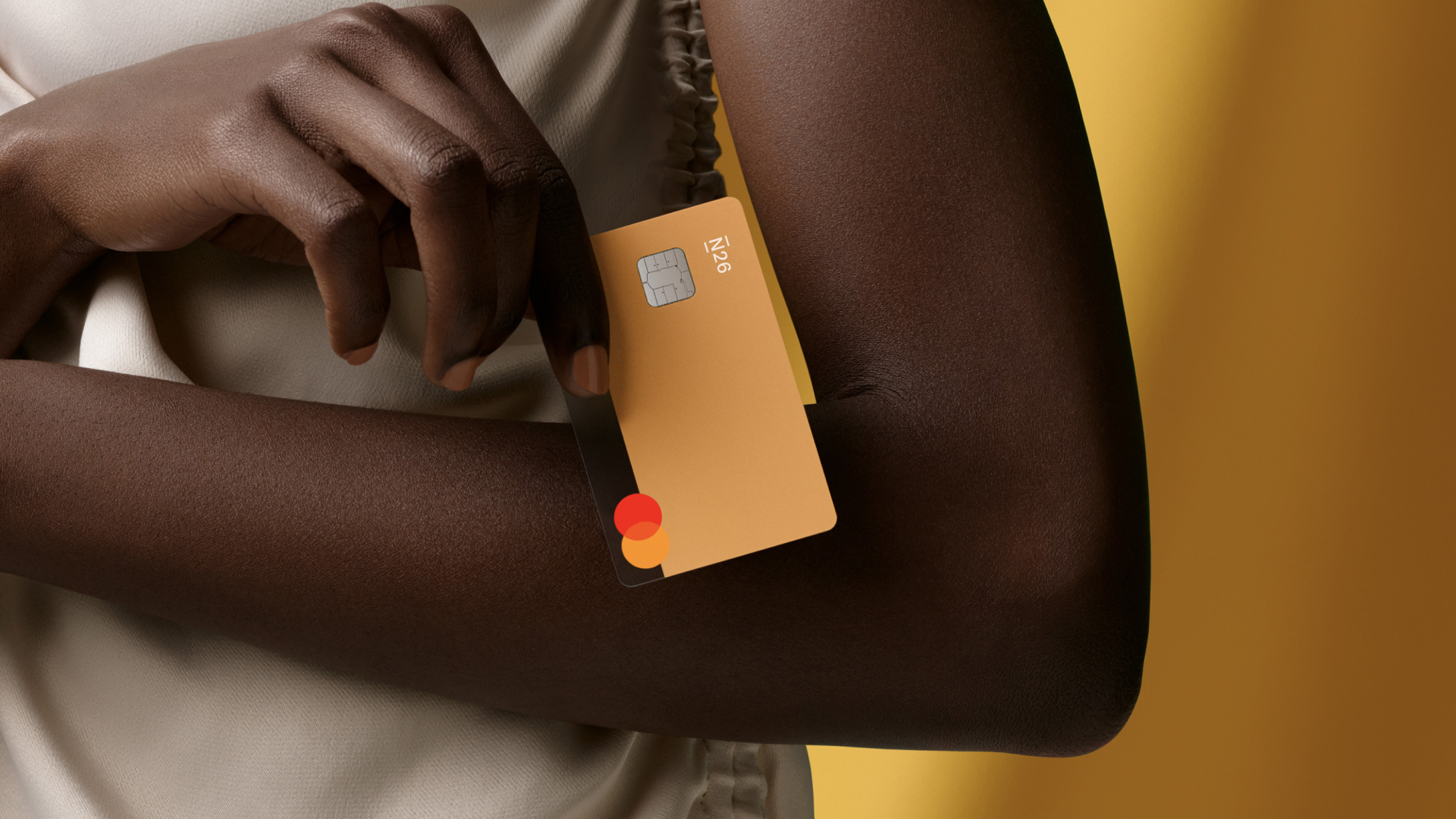
In 2019, N26 expanded their product offering.
My task was to redesign the mid level card,
position it, lead production efforts and design the packaging products. Here is an overview of the project and the response from N26 customers around the world.
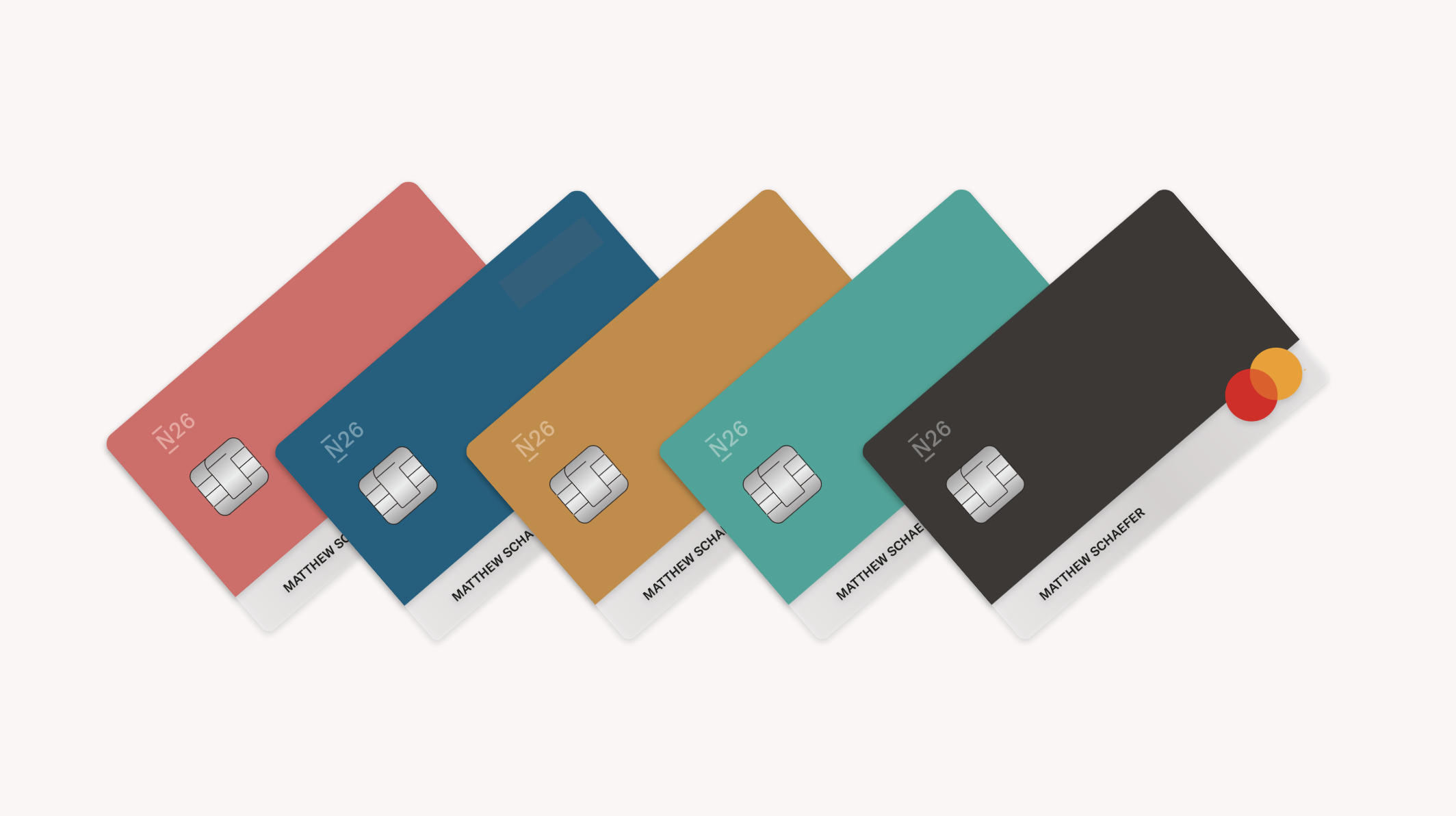
N26 You - 5 colours for 5 personalities
A mid level product sat in between a free N26 account and a paid premium membership. It is part of the premium account offering focused on personalisation. N26 You enables travelers to bank without borders, free from exchange fees when withdrawing cash abroad or making payments in foreign currencies. I worked to create a product offering that reinforced our brand owndership, providing flexibility in marketing and ownsership over personalization for customers.
As one of my main projects at N26, I took a lead role in these areas:
Visual Product Design
Product Materials
Partnership Management
Internal Stakeholder Management
UI Assets and Representation
Packaging
Design decisions were made on how to tier the product. Ex. The free card had all the information on the front, a stark white on black logo and embossed font. Each card tier became more minimal, moving from heavily branded on the N26 basic card to timeless and minimal on the N26 metal product.
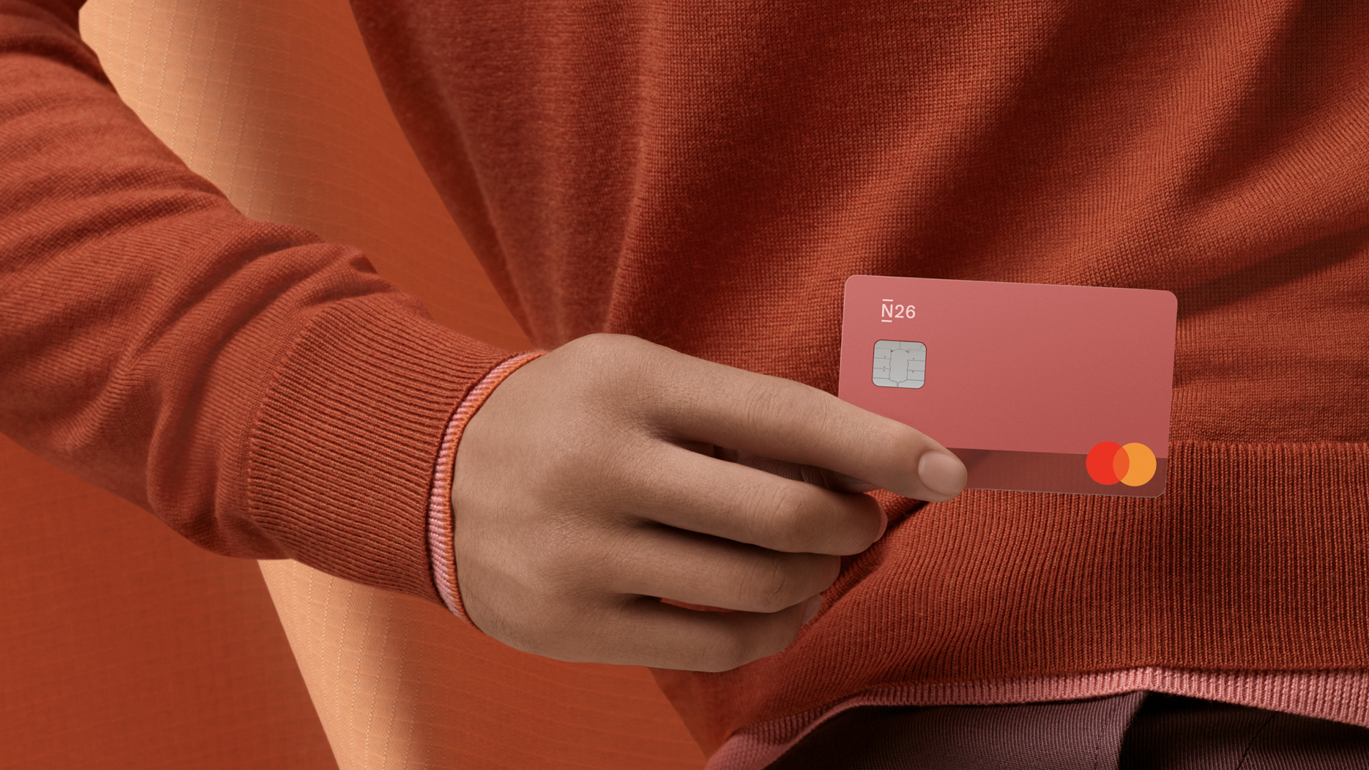
Photography Direction: János Spindler & Greer Chapman
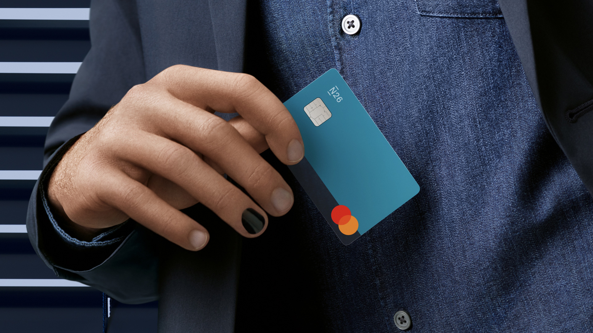
Photography Direction: János Spindler & Greer Chapman
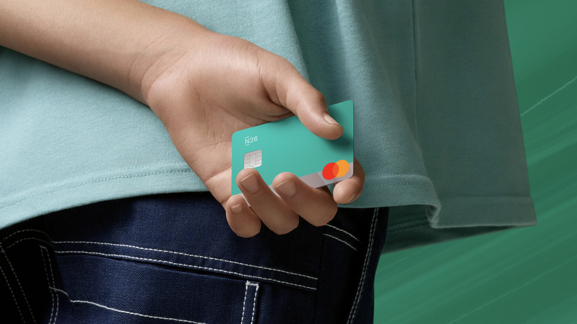
Photography Direction: János Spindler & Greer Chapman
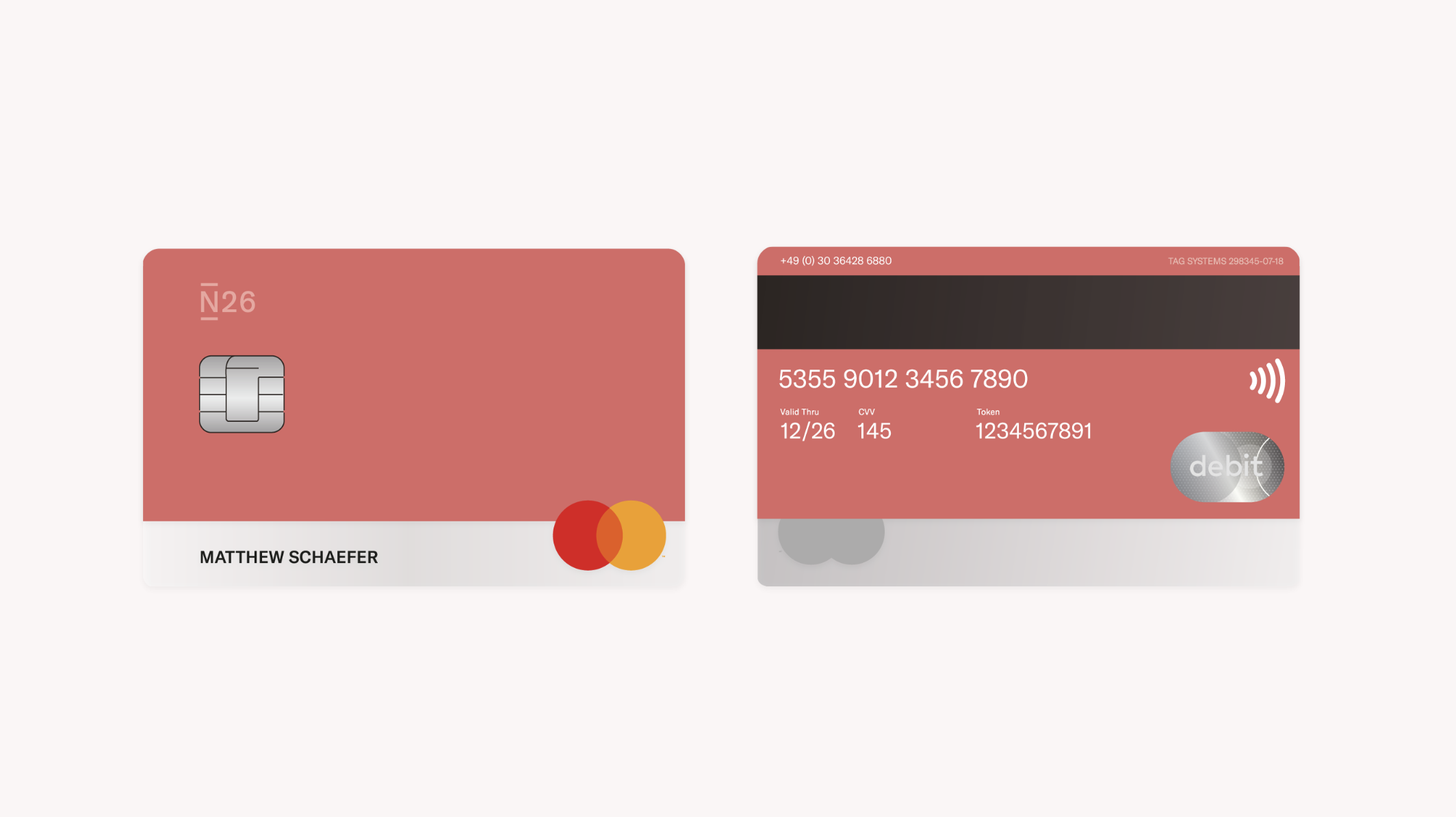
The decision to place the card numbers on the reverse elevated the card from the free N26 card. The N26 logo is a tint of the original Pantone, creating a more subtle effect and moving the card more towards the customer and less towards the company.
Design Inspiration
We knew that people were attached to our N26 Black product that I had the opportunity to design a few years before. Our goal was to redo this product, widen its audience and mature the overall aesthetic.
Through rapid design iterations, both physical and digital, we experimented with over 30 design colours The goal was to have a colour that everyone could strongly identify with. We found that people still prefered the darker tones - explaining the need to feel "serious" while paying. We also learned found that testing physical cards people prefered to have a stronger saturation in colour as opposed to muted tones.
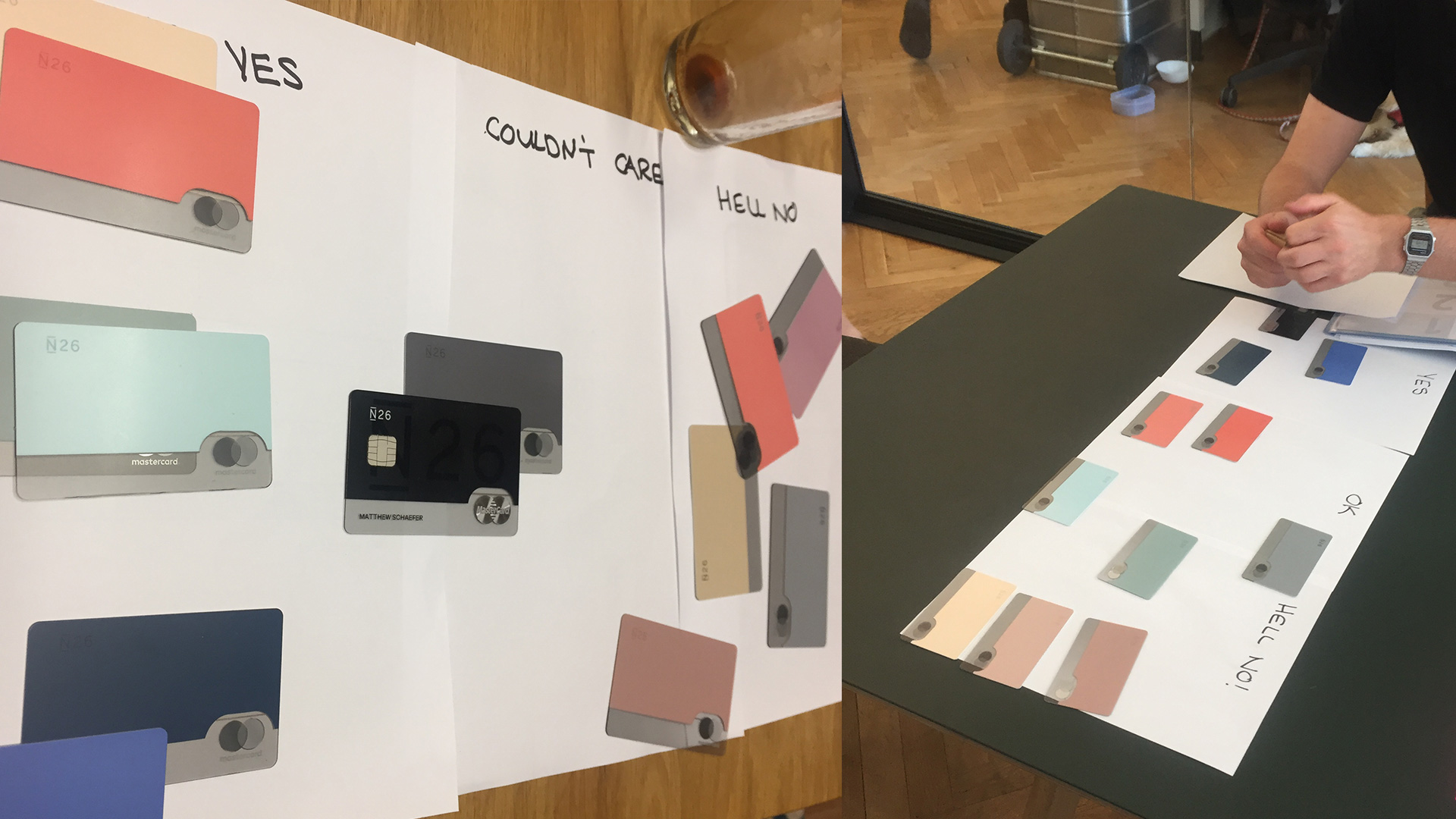
Through rapid design iterations, both physical and digital, we experimented with over 30 design colours The goal was to have a colour that everyone could strongly identify with.
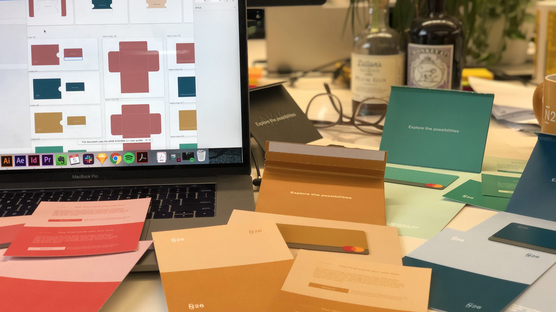
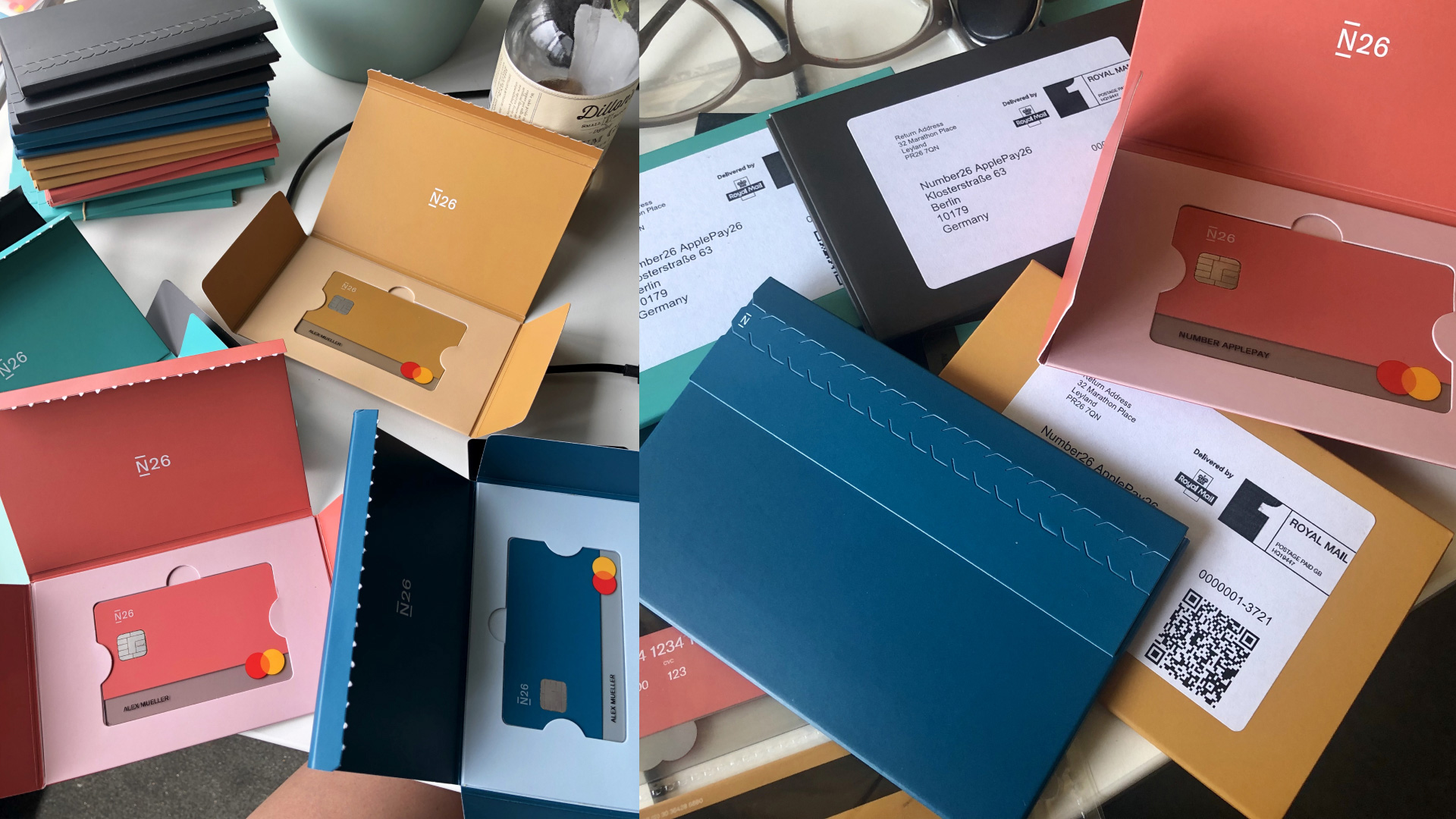
I really wanted to make a package that was environmentally friendly. I worked to create a custom dieline that was a mailer and card carrier together. When working with cards it was really important for me to test of manual fulfillment ease and packaging security.
Design Difficulties and Solution
The colour matching was extremely difficult. We decided to print a layer of silkscreen white under the transparency to create a more opaque, strong colour. The IR blocker which is mandatory on cards also caused the colour to change and we decided to place the blocker on a separate layer of transparent core to avoid this. The Pantone printed on the top was done in silkscreen. We placed important on the N26 logo, making sure that it appears slightly at the top of a card wallet. The ink is custom made for N26, mixing both a varnish and pantone together to create a haptic effect.
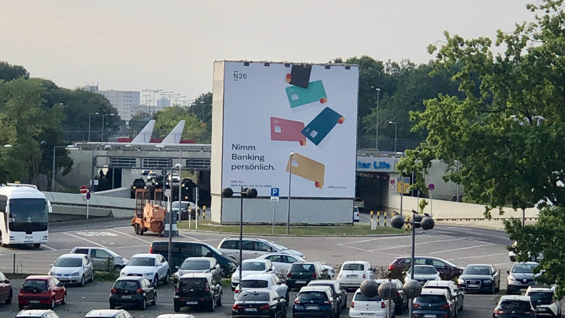
N26 You marketing efforts placed campaigns in 6 major cities in Europe.
Learnings
Through this project I learned operational experience that is irreplaceable. As N26 scaled I needed to maintain a great product from 5 production facilities in 3 continents. I went to Brazil, Spain, Andorra, London and the USA to ensure quality across facilies and packaging employees.
I believe that this product gave an incredible boost to the branding of N26. In the future, I would, however question the operational effectiveness of running 5 designs in 23 markets. In the future I would limit this product to 2, max 3 designs.
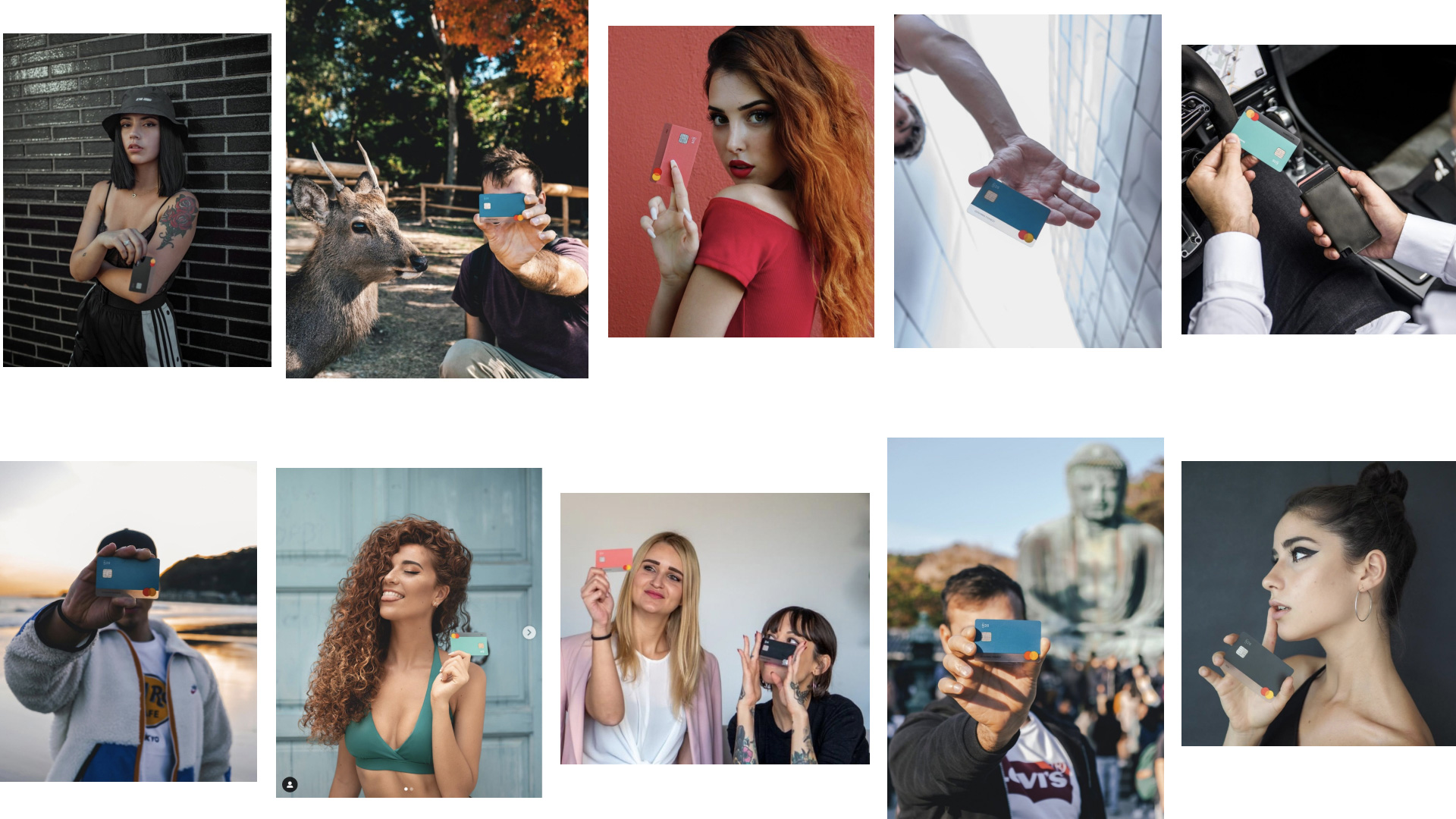
Social media and N26 Influencers proudly shared their cards worldwide.
Taryn Niesena
Taryn Niesena
Berlin, Germany
taryn@niesena.com
Taryn Niesena
Berlin, Germany
taryn@niesena.com