Tiered Product Systems N26 GmbH
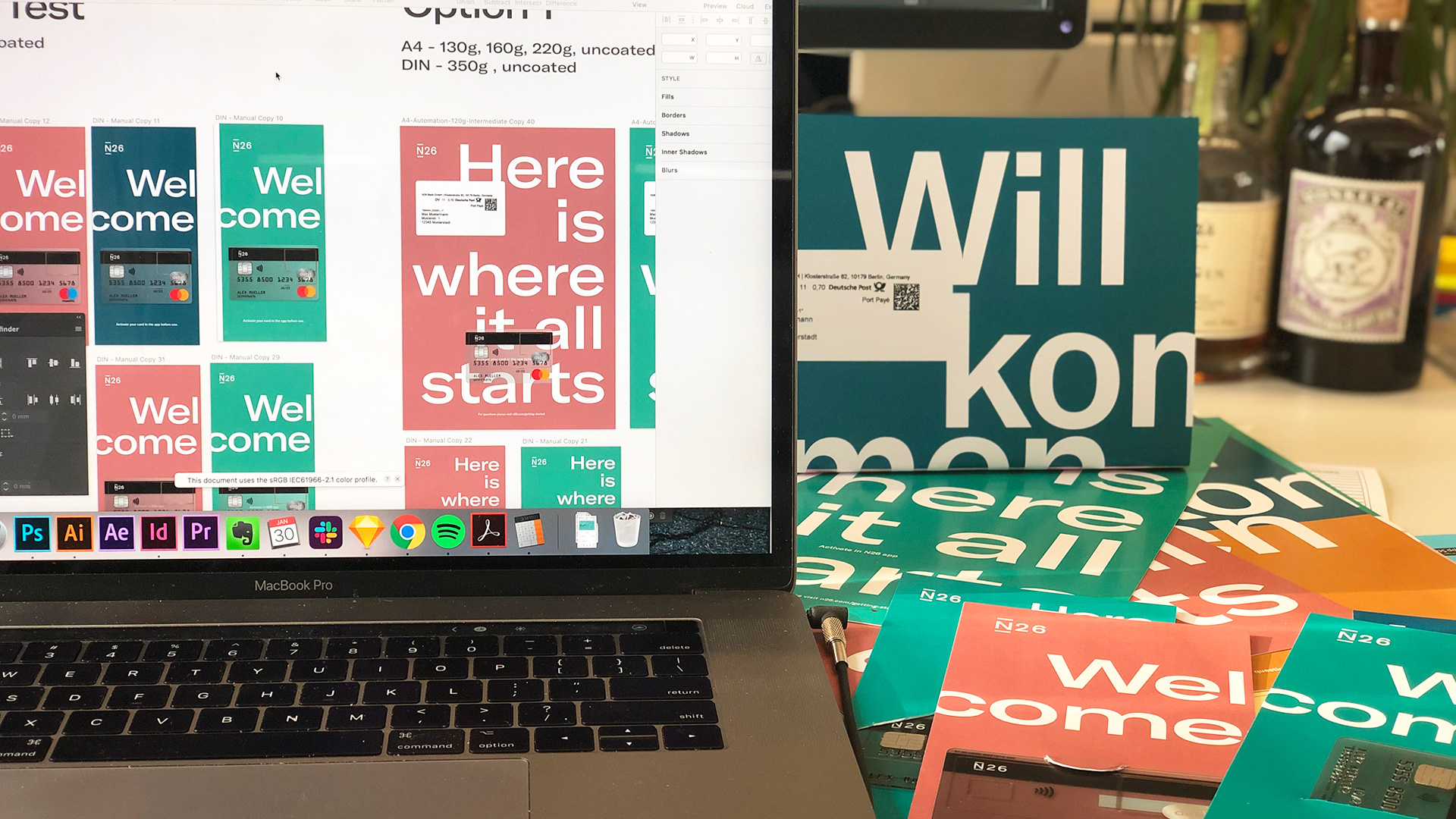
In 2018, N26 expanded their product offering.
My task was to redesign how to separate the product,
position it and design the physical card and packaging products
while taking into consideration a tiered value proposition.
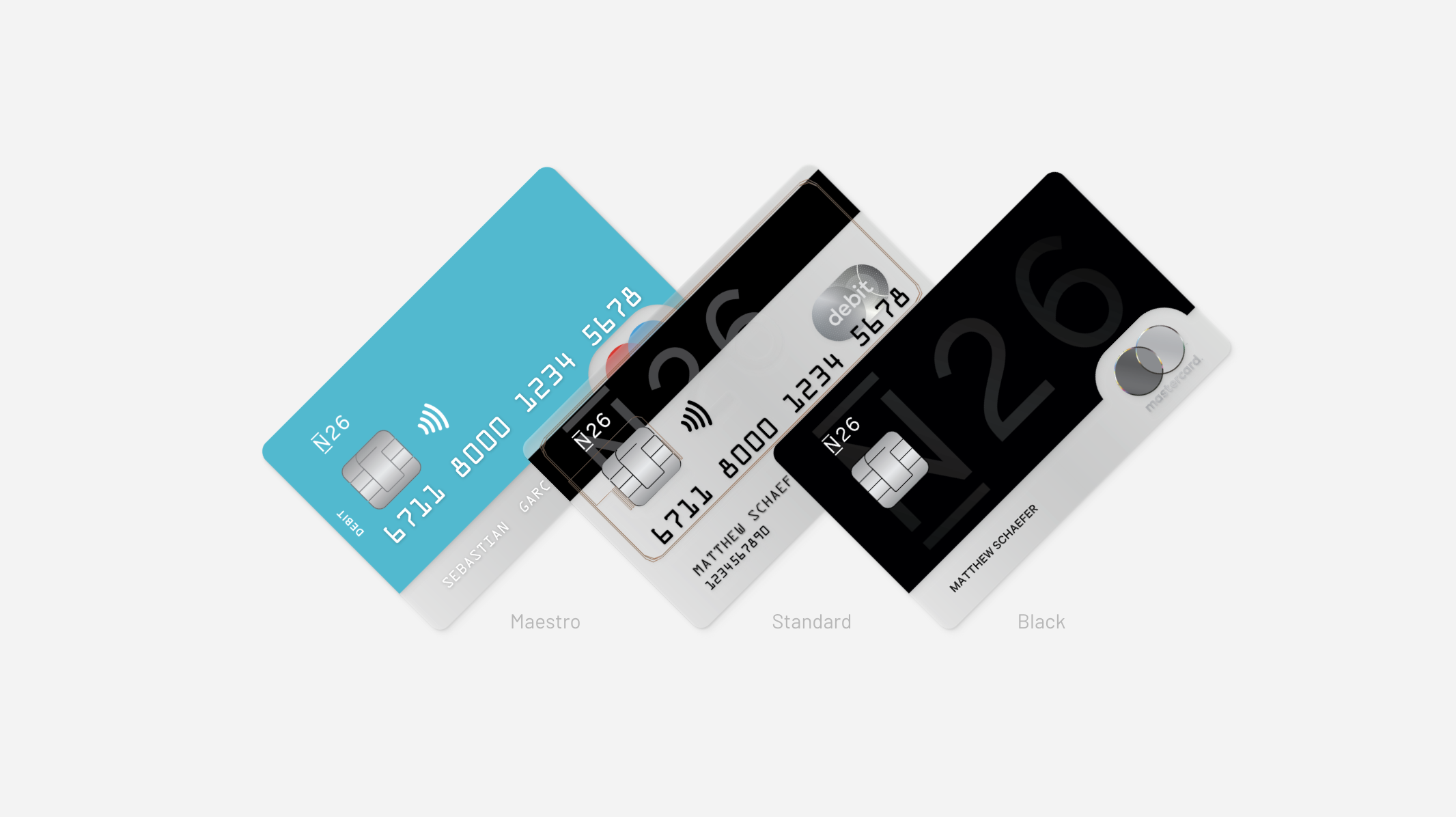
N26 Card Portfolio prior to redesign
In many startups you create products as you need them, very rarely taking into consideration how that product can expand for the future. My task was to backtrack through our products, and redesign them to add value to our offering at 3 different levels. Below you can see the proposal and structure on how I presented this to internal stakeholders.
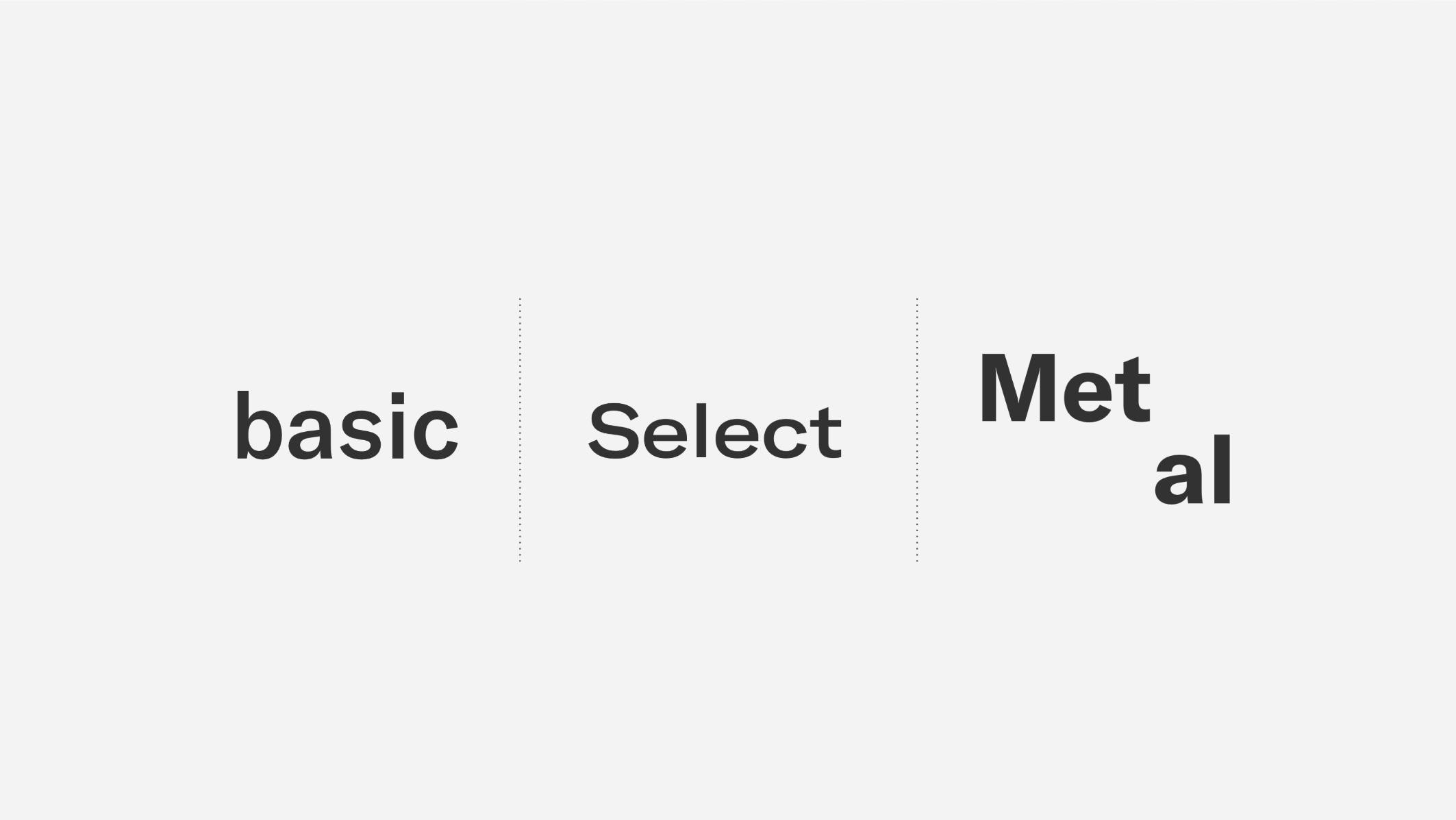

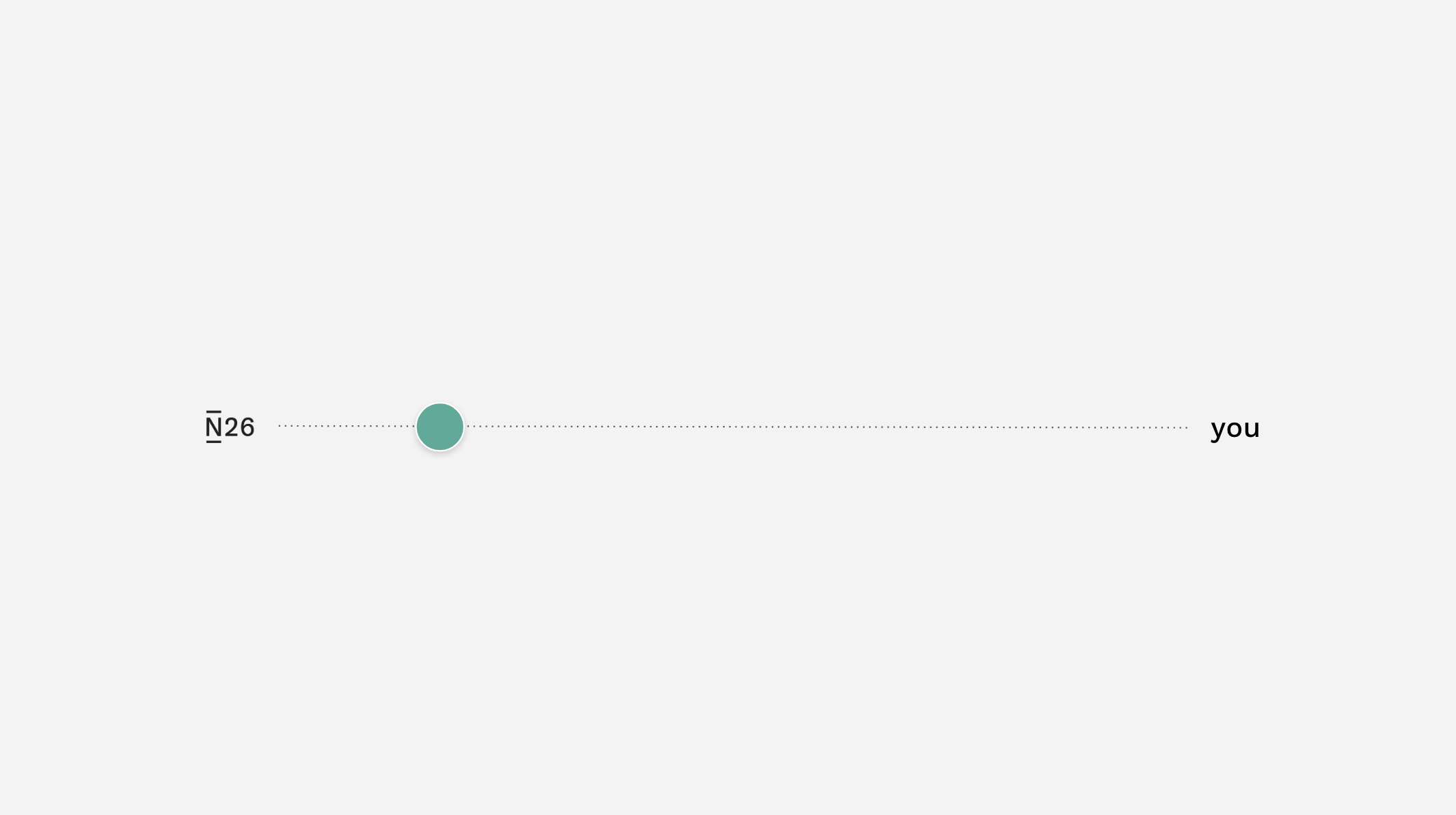
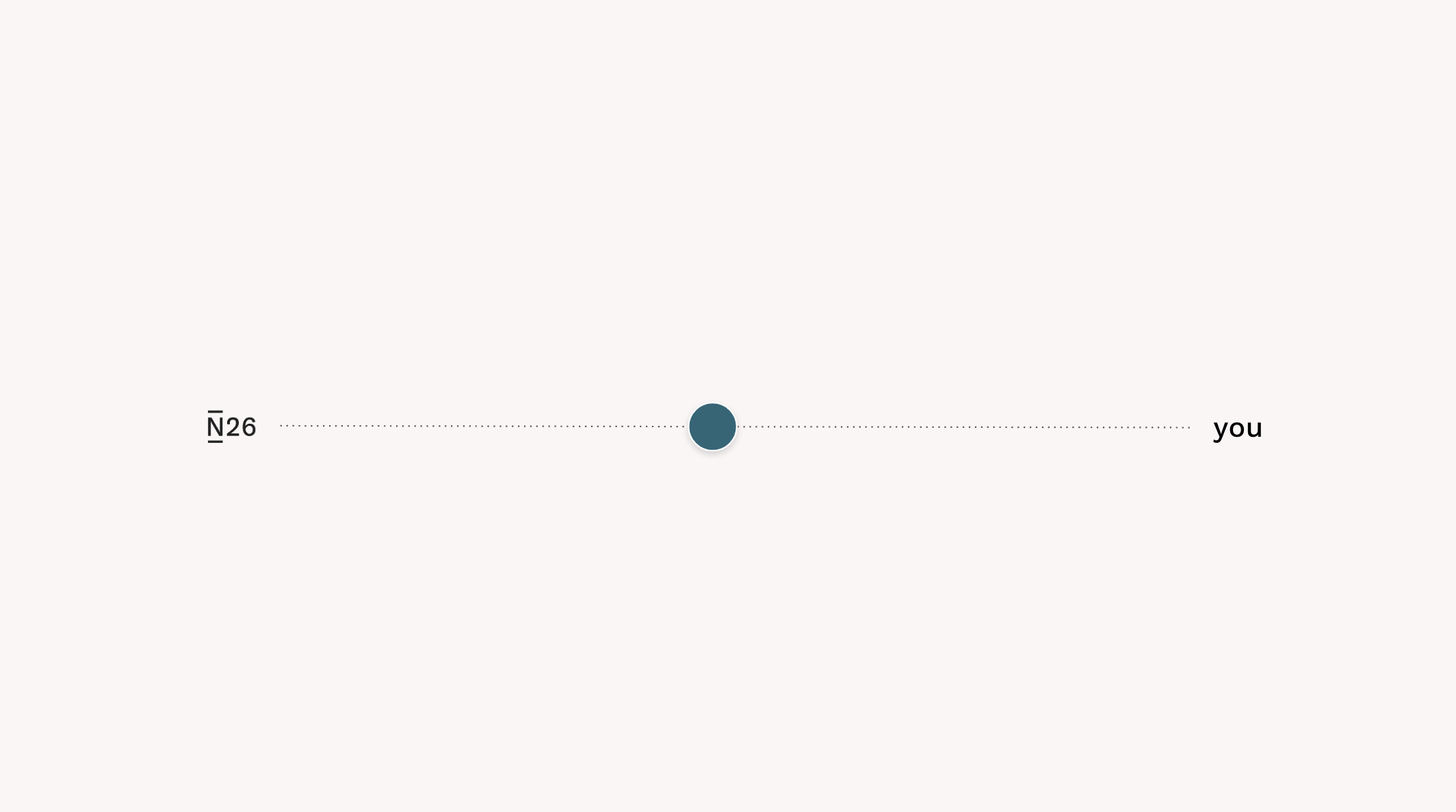
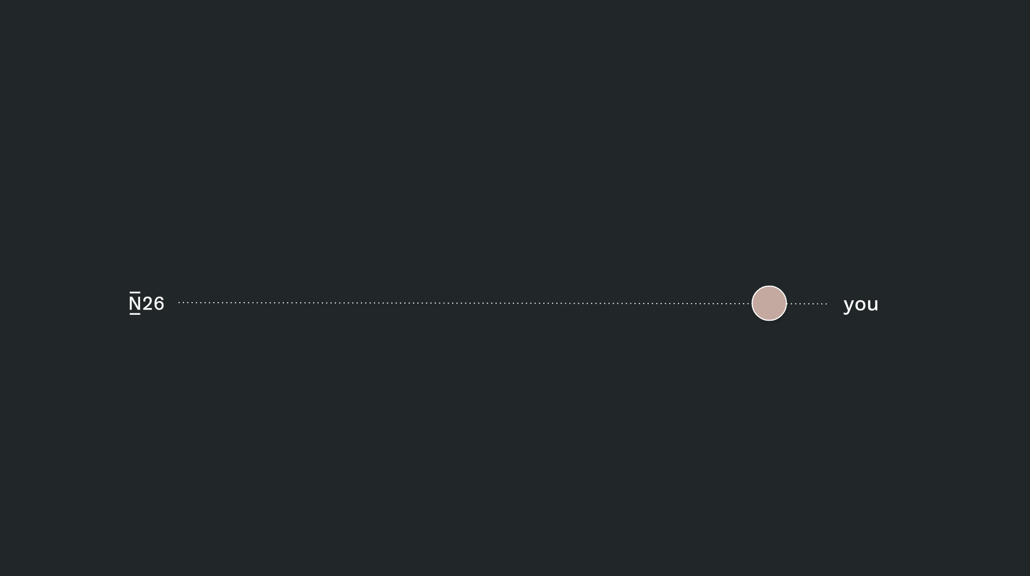
As product tiers scale it was helpful to place where this products visual design is in relation to N26 and the customer. At a basic level product the N26 brand is highly visible. As product tiers move up the shift from N26 to you becomes more apparent. N26 releases the brand, adding more customization and added value.
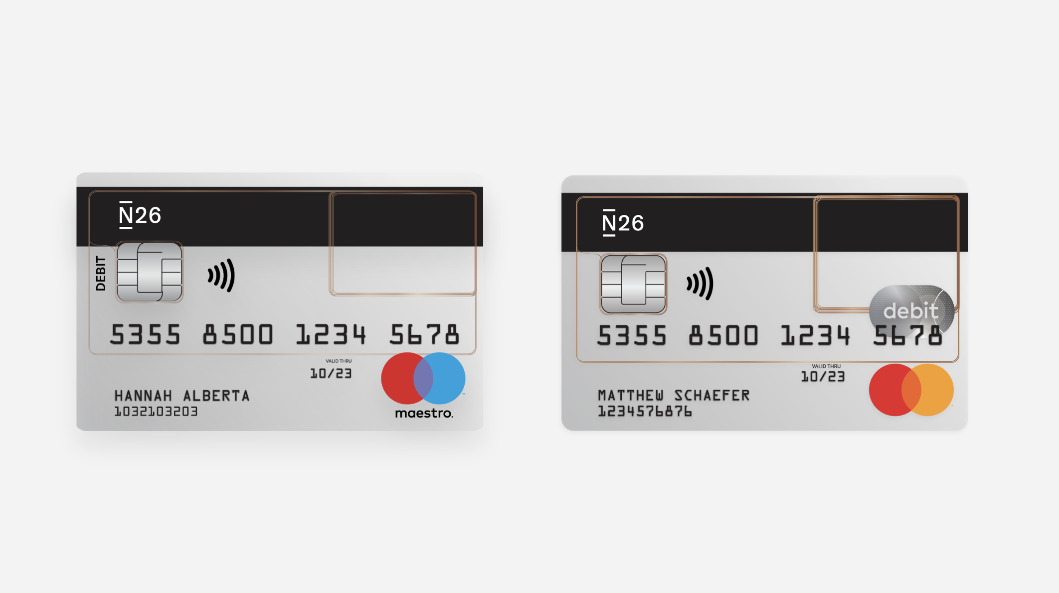
Our first decision was to level the Maestro card with our Basic card. We did this because Maestro should not be seen as a separate brand or product but an extension of our Basic card offering. As an entry level card it reflects N26's core promise for a transparent, technology first banking experience.
Select was our biggest change proposal. We decided we wanted to introduce a higher tiered product above what is known as "black" and we needed to differentiate the offering. N26 Black was N26's best performing product therefore we wanted to build off of our original design but expand the product to become more inclusive.
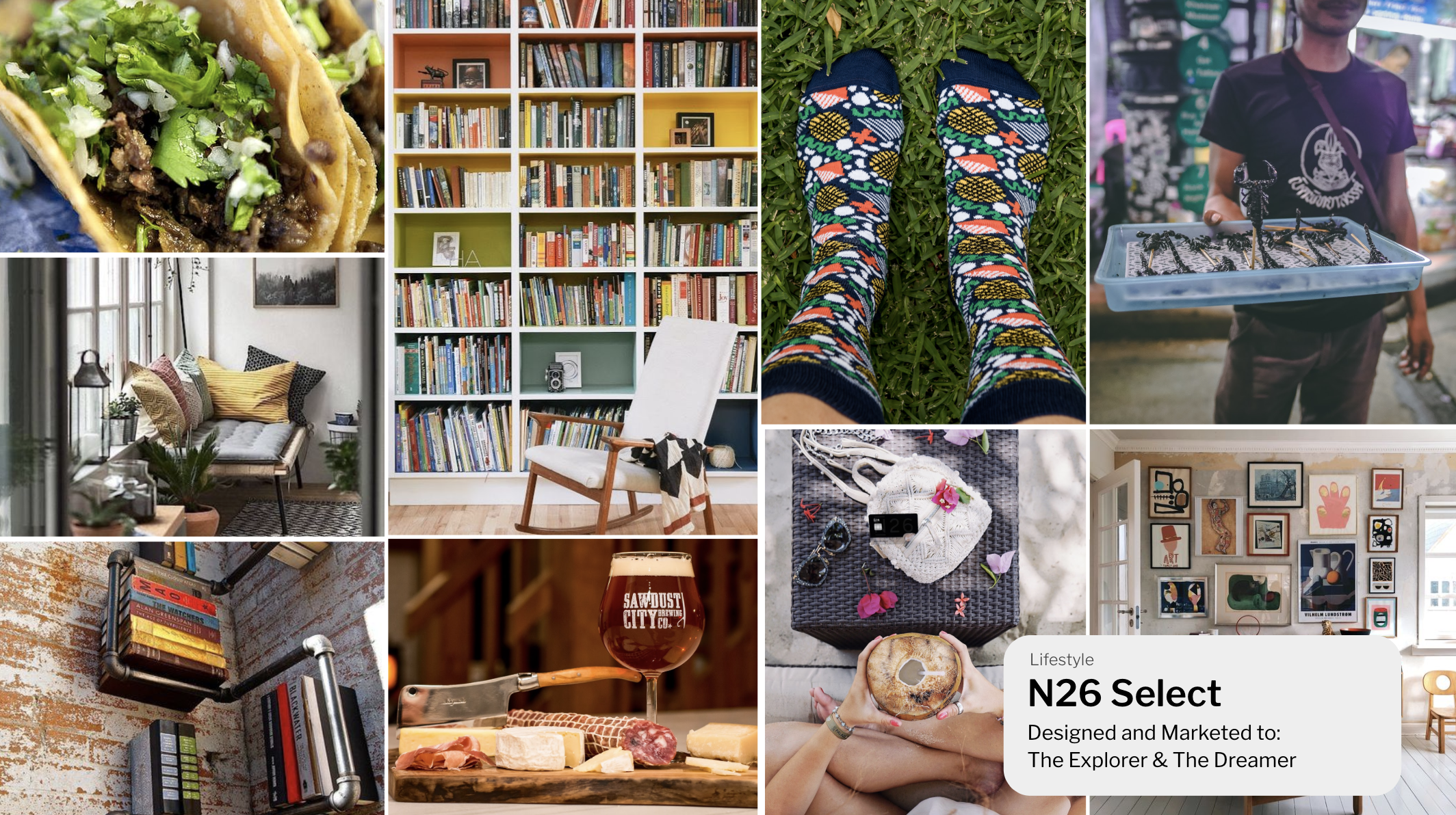
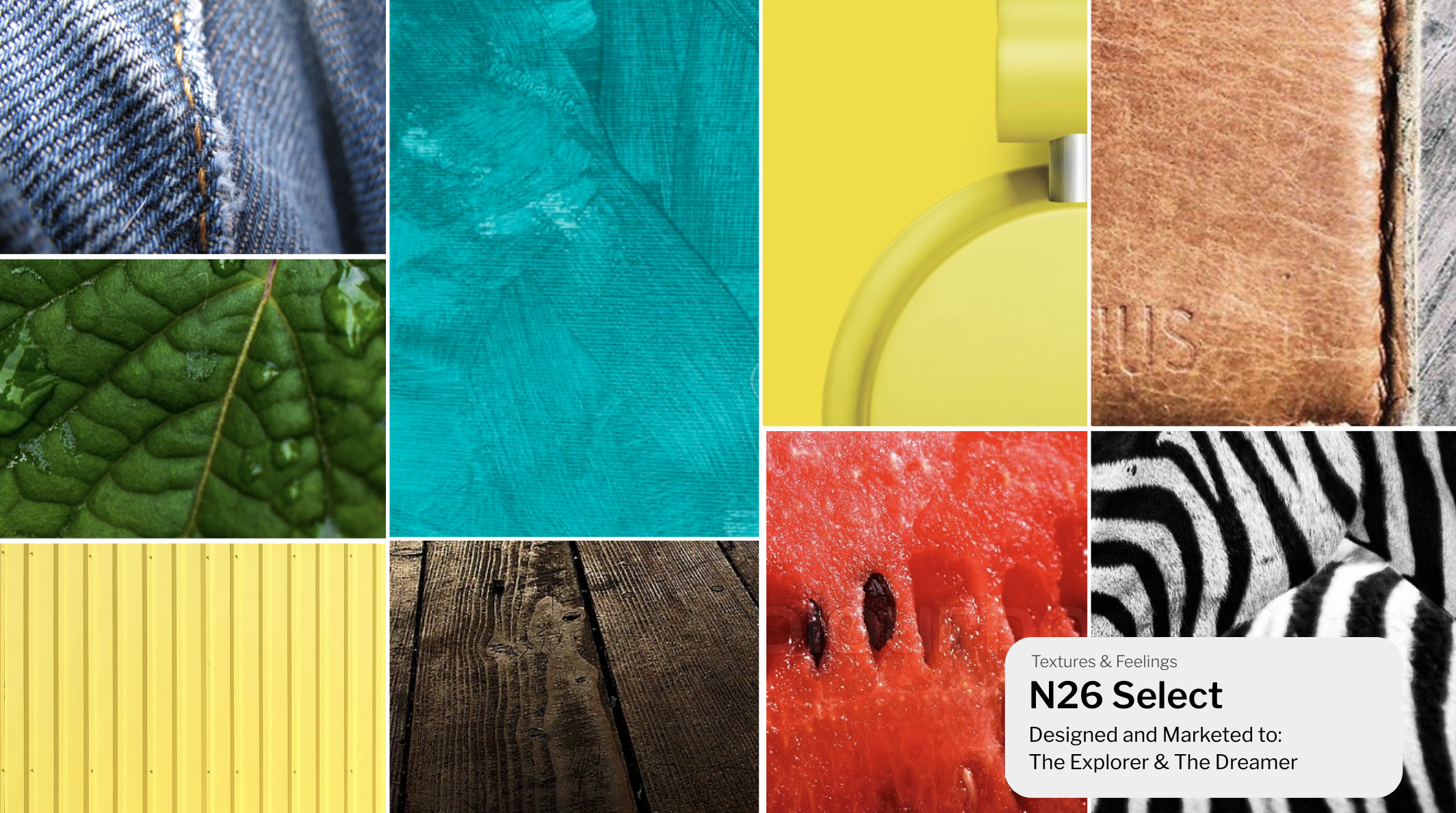
We envisioned Select to be about enabling customers to have choice. It is using words like "discover" "explore" "unlock" - The voice of Select is laid back, searching for adventure whether at home or while travelling. The mid level product enables you to explore possibilities without restrictions.
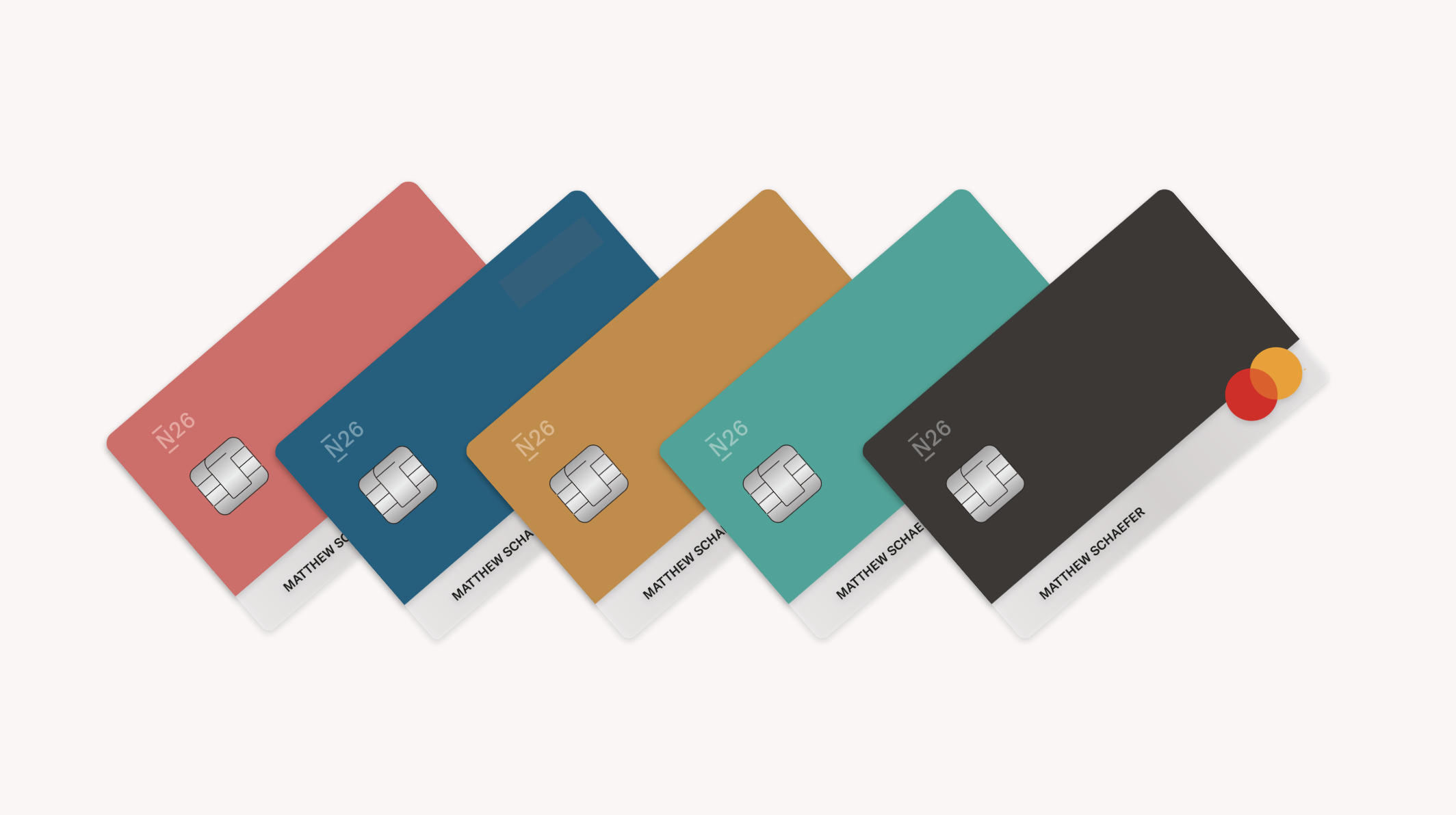
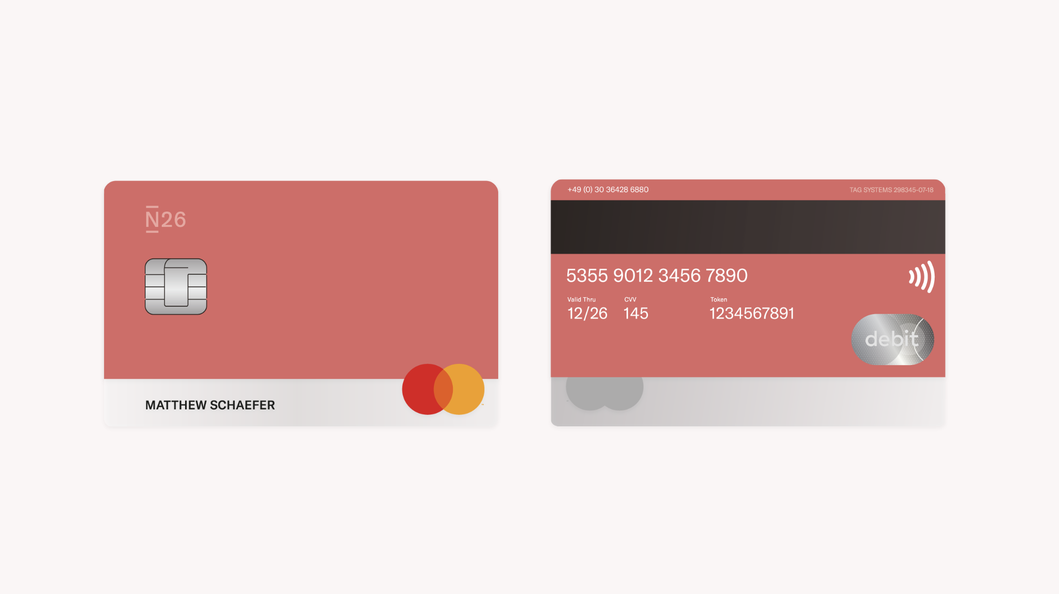
The N26 logo starts to become less visible. Instead of being white sitting on a black background it now sits as a 60% tint of the primary N26 brand colours. We pull back allowing the customer to express themselves more.
On the Select product we move the Personal Identification Number and Valid Thru numbers to the back. This moves card from being a physical banking product to a lifestyle piece reflecting the customers choice of colour. The logo becomes less intrusive, and to make room for a more premium product we remove "Black" and introduced "Raven" an off-black alternative.

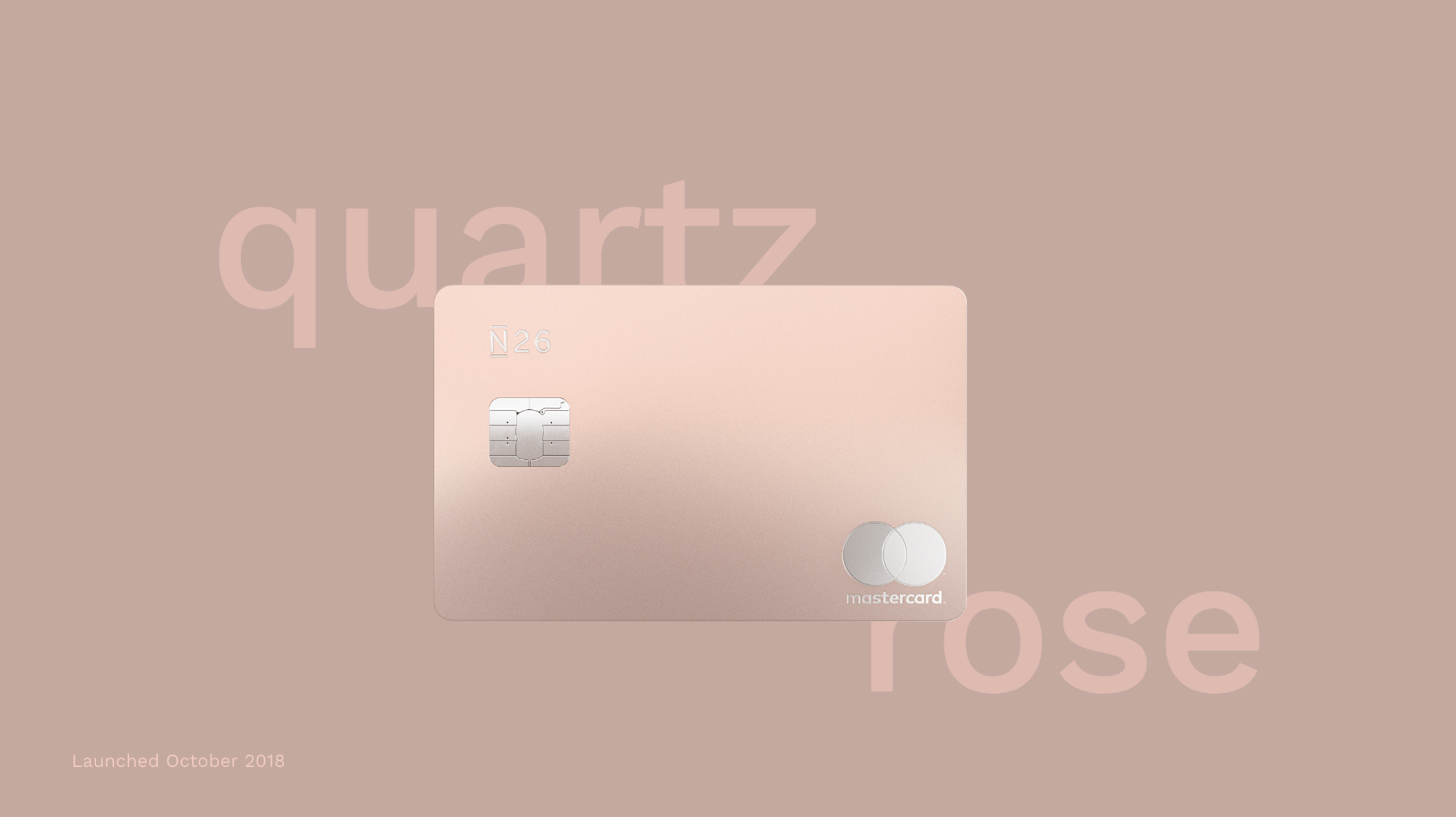
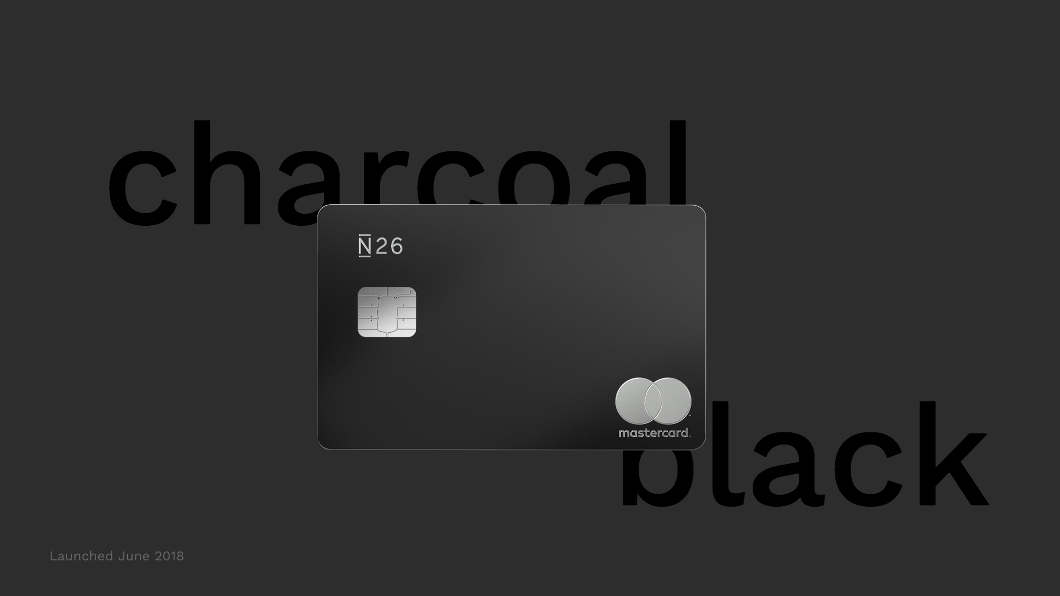
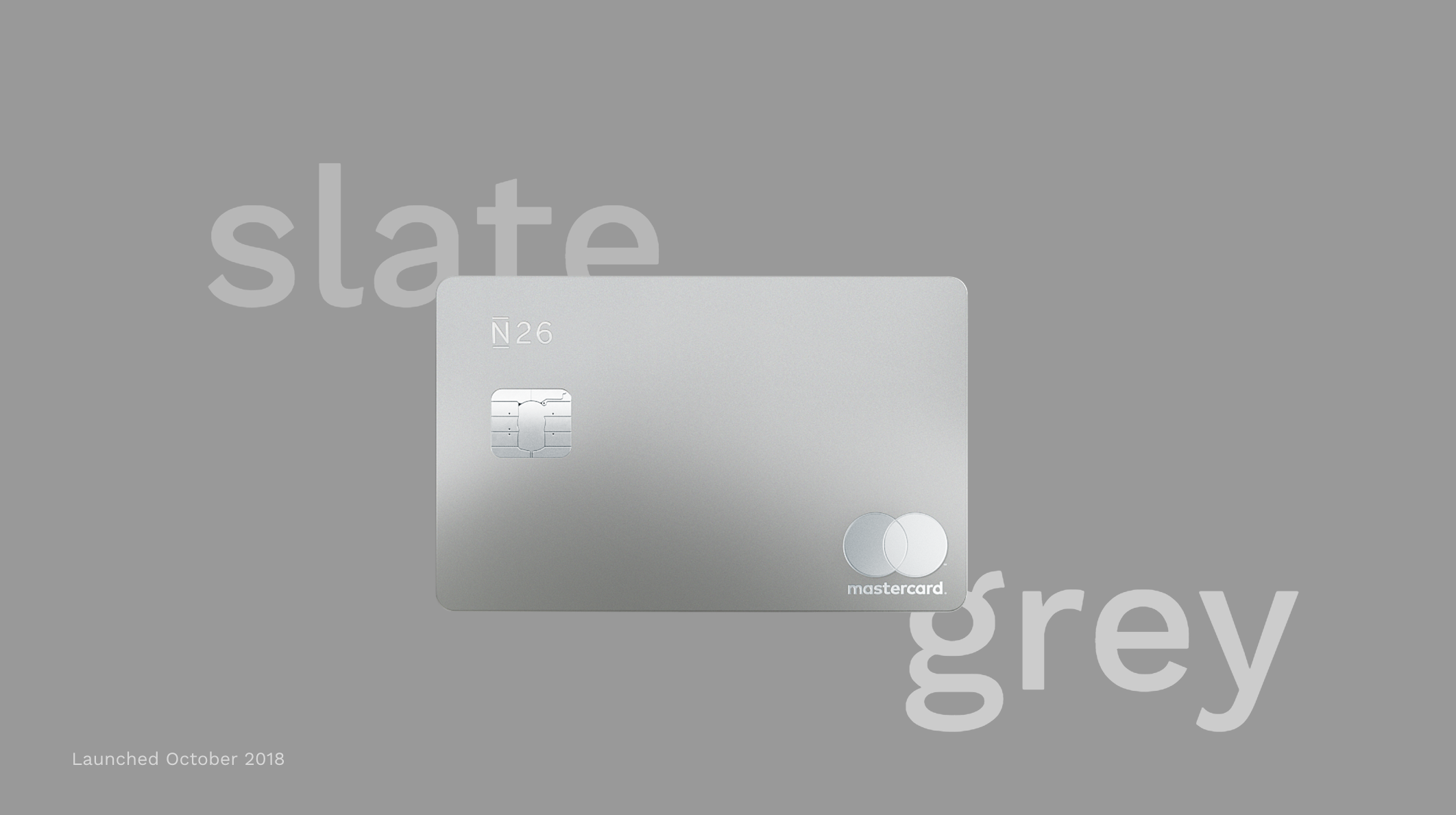
Through data we realized that there was room to separate our "N26 Black" product into two affluent sub brands. This became "N26 Metal". N26 Metal was designed to make a statement with the card weighing 3X more than a standard card.

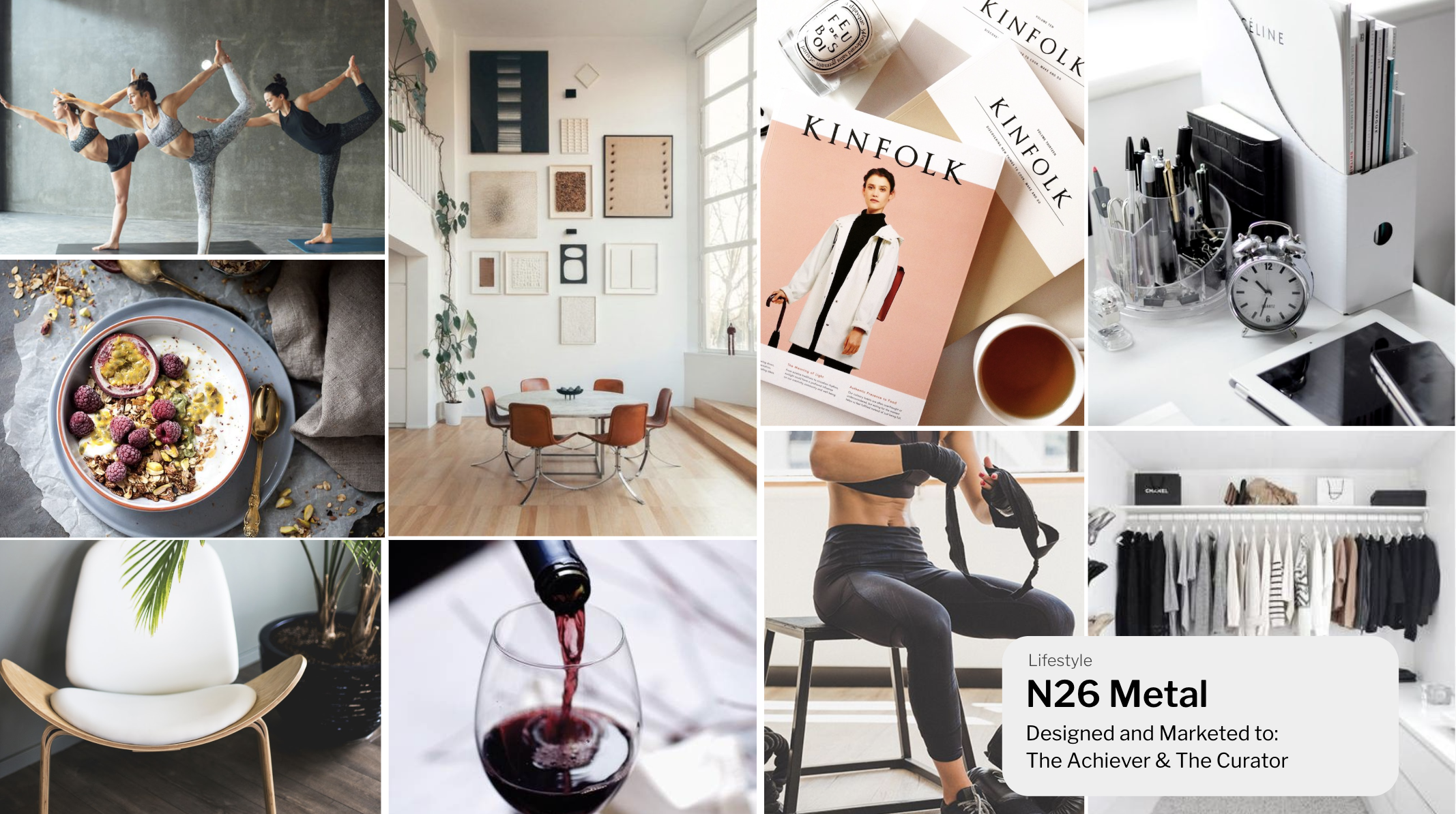
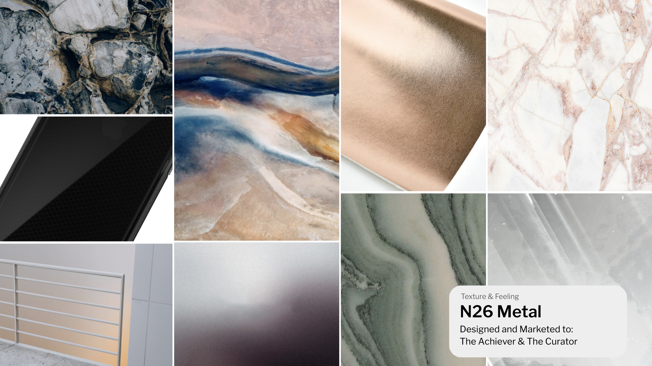
We designed the card to be the first card worldwide to hold all the information on the reverse creating a minimal, clean asthetic.
It is also marketed differently from the Select product because the individual that purchases Metal is interested more in status and luxury and therefore the cards are shown individually rather than grouped together.
Back to Homepage
Contact Me . Download CV . LinkedIn . +49 (0) 152 377 39722