N26 - PRODUCT DESIGN
Designing an intuitive payment flow
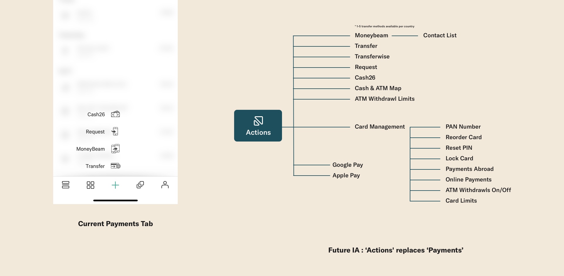
One of the most important parts of the N26 App is the ability to make seamless payments. I was part of a small team responsible for the redesign of the N26 Actions Tab. This includes the users flow to begin a payment, access to card settings and ATM Map locations.
User Pain-Points
The 'Actions' tab had not been utalized to its full potential. By looking at our overall company OKR's we iterated creating a rough prototype to test our initial designs. Our goal is to 'Reduce complexity and anticipate customer needs'. Our secondary goals are the following:
Discoverability - Users don’t know what products we offer. Card Management features are currently, not discoverable or clear.
Education - Available 'Actions' are confusing or unknown to users
Control - Users want more easy, accessible control over their banking.
This was the protoype that was used for User Testing.
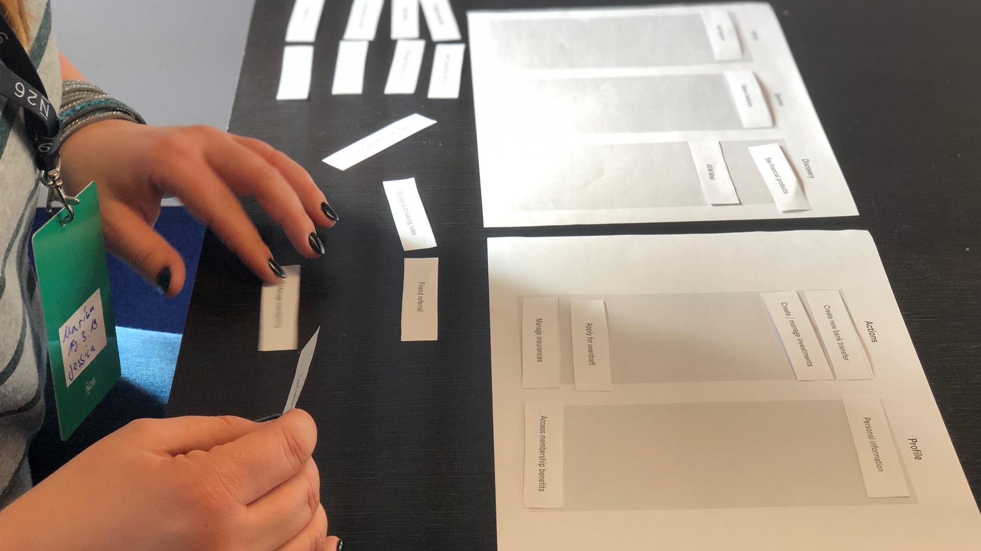
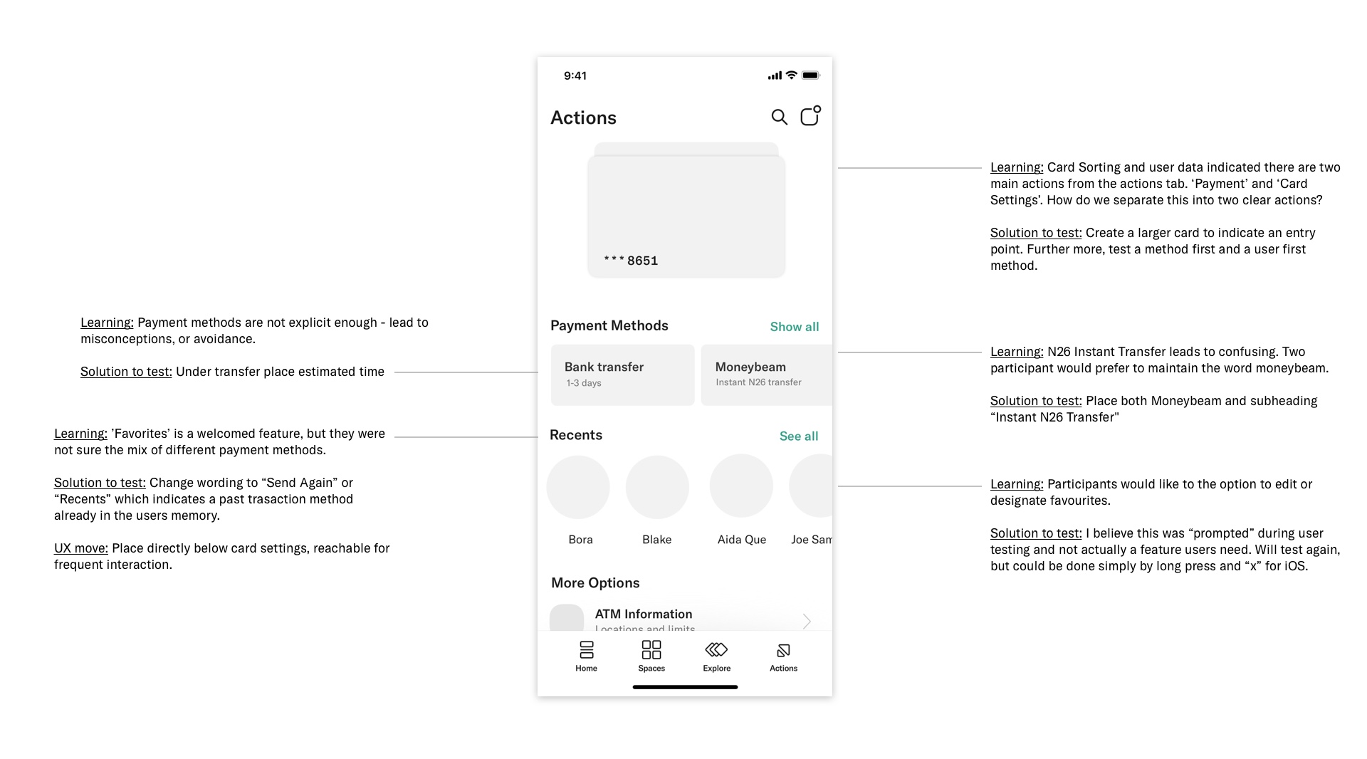
Card sorting is one of the methods that we used to better understand how our users grouped the information presented.
Design & Development Sprint
A small team was set up, this included a Product Designer, Sr. Product Designer, Research, iOS & Android Developers and the Product Owner. A 2-day sprint helped us to come up with clear hypothesis’ and a wireframe prototype. From here we moved into qualatative testing what we believed could solve our users pain points.
User Testing - Learnings
Through user testing we found out, among others, that 'Standing Order' is not clear to all, information cards would likely be dismissed, or ‘filtered’ out and participants had different interpretations of what 'request' could be.
We decided that we needed to jump back a step and anticipate better what a user wants from the "Actions" tab. Based on internal feedback and user testing we moved ahead creating two extremely different options for further testing.
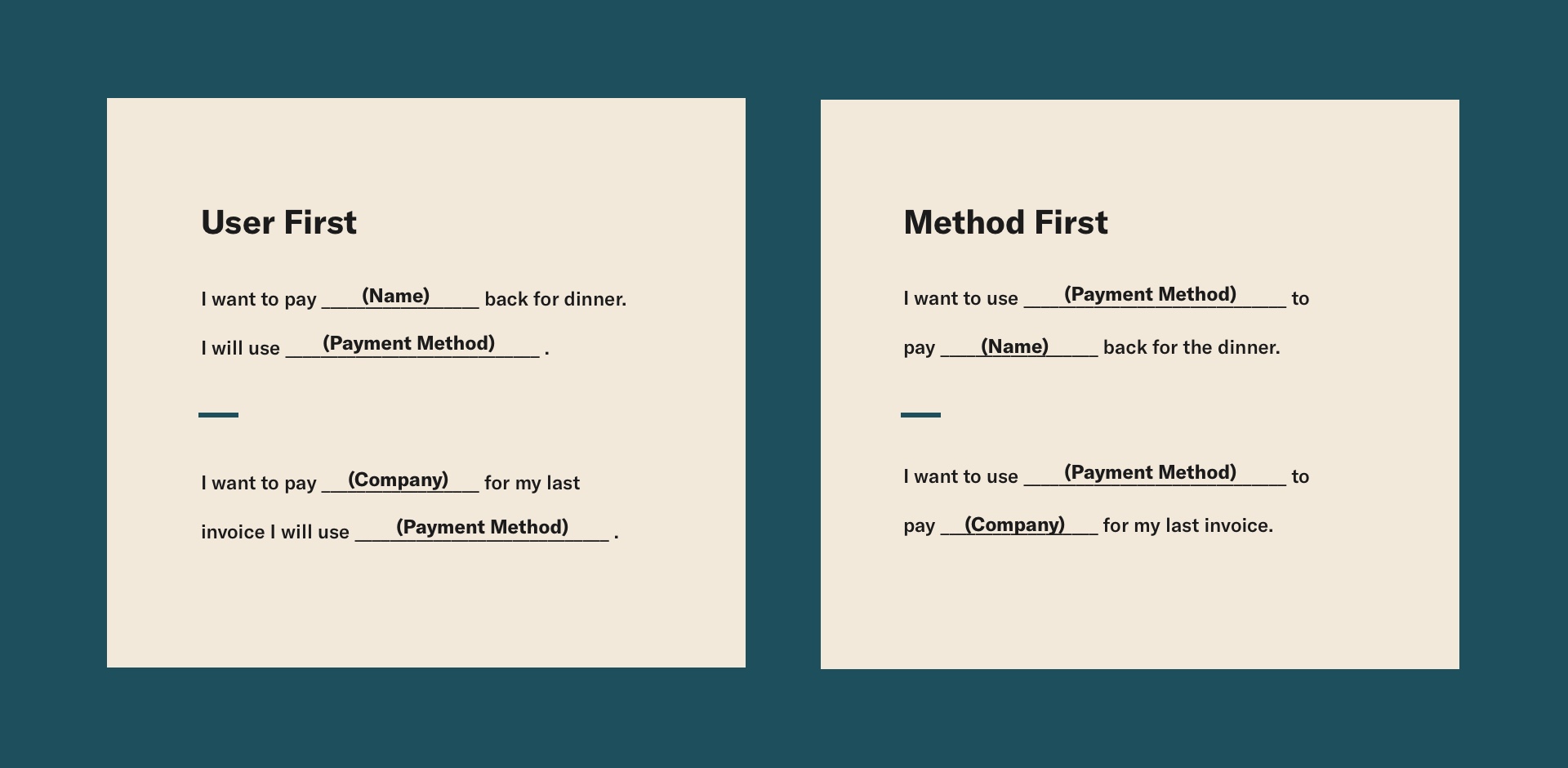
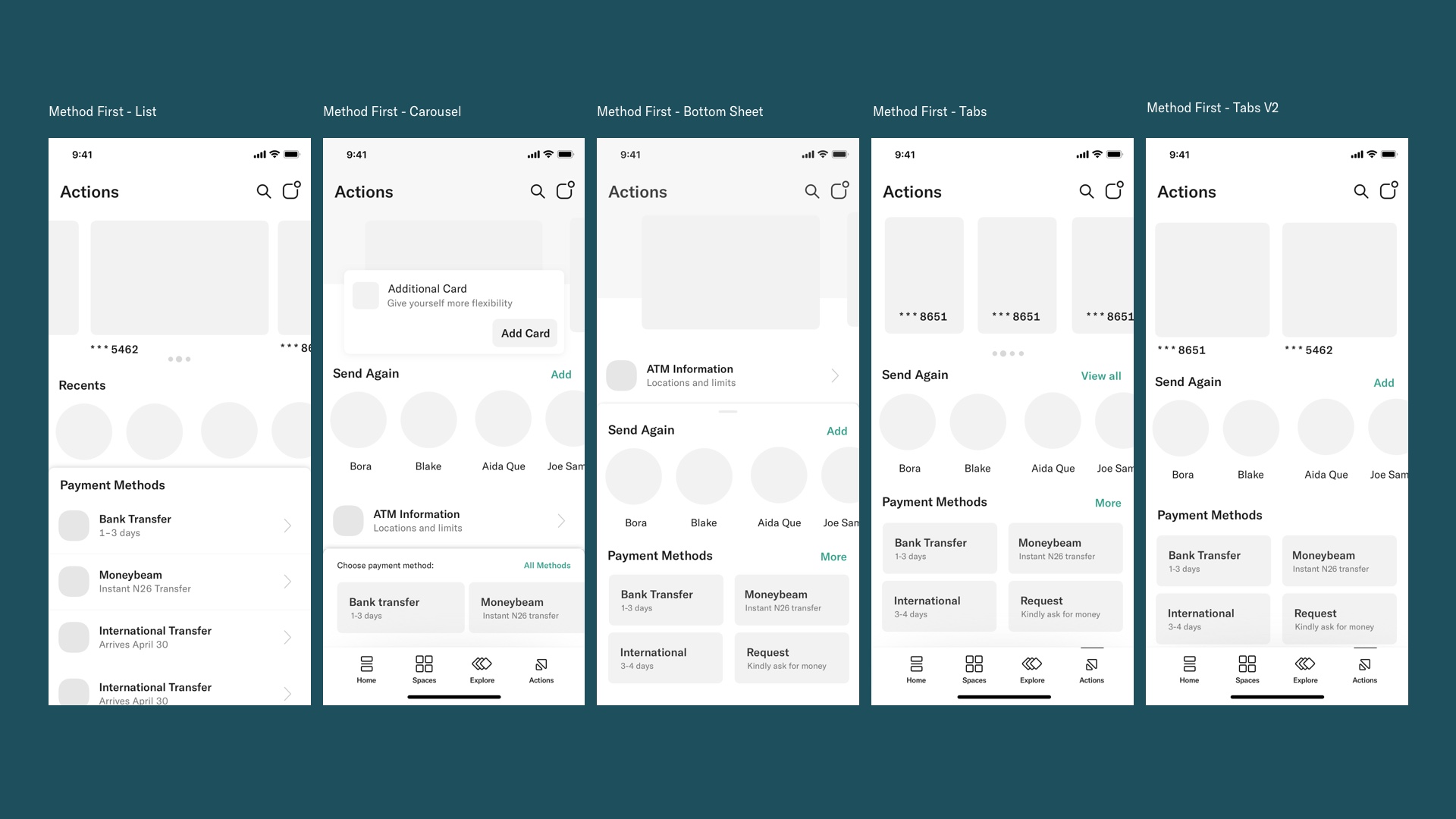
Method First Approach
Implementing the learnings from our User Testing we iterated to create a 'Methods First' approach. We did our best to minimize the amount of information on the screen, country-specific elements and anticipated future features.
Our hypothesis to test: We believe that users will find all relevant actions on the first screen. We would like to test if there is too much choice and a user is unable to take action.
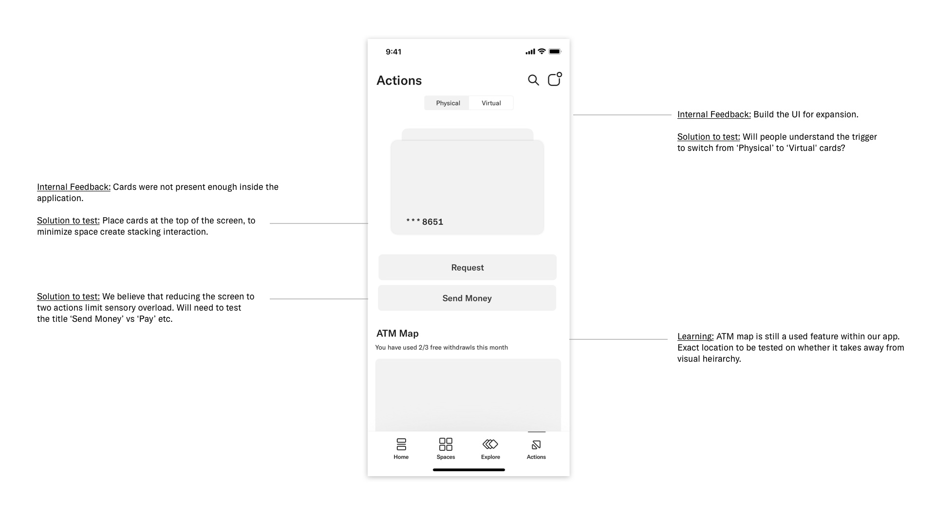
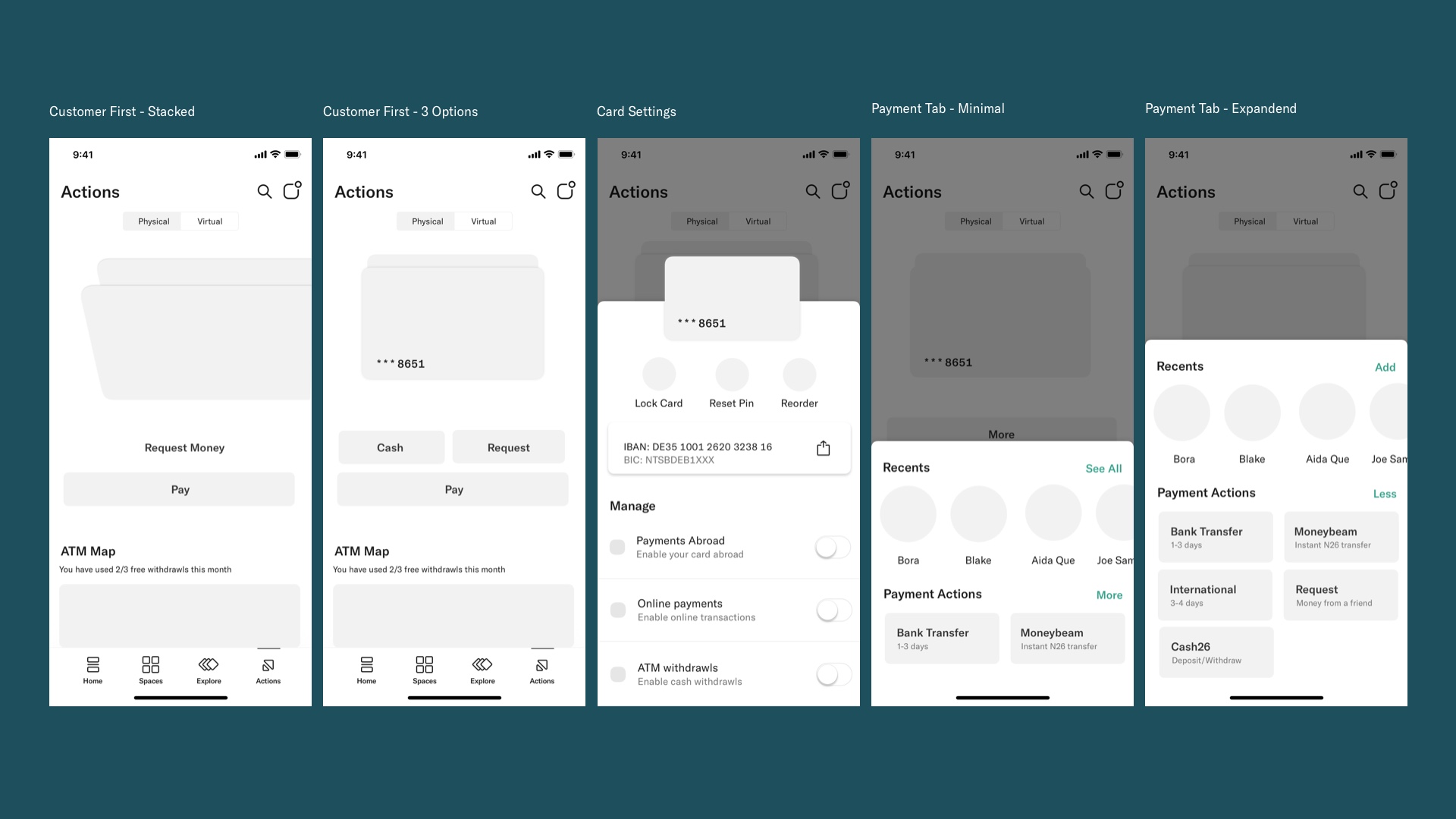
User First Approach
N26 is know for its simple approach to banking. We wanted to create an alternative design going back to our goal of "Reducing complexitiy and anticipating customer needs". This design separates the entry point to "Card Settings" and the entry point to "Making a payment". It highlights the card designs and anticipates user interaction.
Our hypothesis to test: We believe that users will find simplicity in the user flow. It adds one extra step but funnels a users thought process between “Card Settings” and “Payment Options”.
A small sample of wireframe interations and potential flows
A fleshed out UI used as a prototype to test user interaction and perception of the experience.
Outcome
Throughout our second round of user testing we realized that both options were two far in one direction. The method first approach felt too overwhealming with the amount of options to send and receive money, while the user centered approach was perceived as being a longer flow, even though they were the same amount of steps. Users felt like we were treating them as children when they simply had a large card and two options. We decided to combine the two approaches.
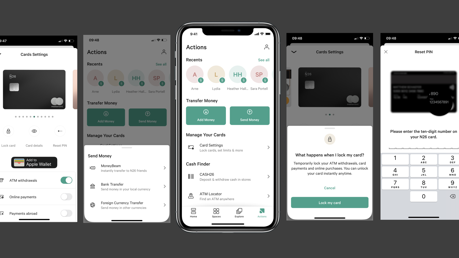
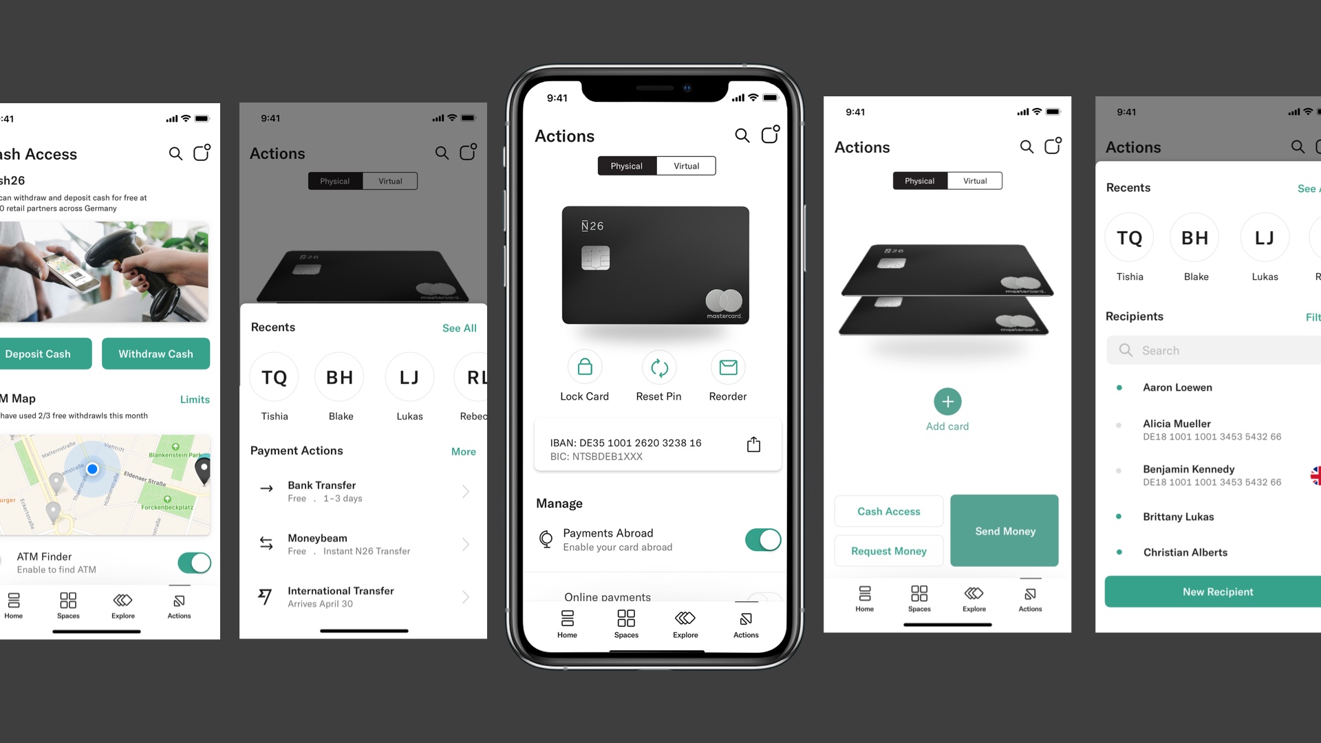
Here is our final solution that was launched in late 2019 to over 4 million users.
Taryn Niesena
Taryn Niesena
Berlin, Germany
taryn@niesena.com
Taryn Niesena
Berlin, Germany
taryn@niesena.com